Top 3 Button Colors for Coaching and Wellness Websites (and Which Colors to Avoid)
Whether you are building a website or new sales page, color plays a big role in how well they will perform. After some extensive testing, I've discovered which colors perform the best (and why), plus which colors did poorly. Lets' dive in!
Why button color matters more than you think
Color influences emotion and action. For coaching and wellness brands that want to create trust, calm, and alignment, the color of your call to action button can change whether someone clicks or scrolls past. Subconsciously people read color as intent. The right hue can invite a gentle yes. The wrong one can trigger confusion or resistance.
Colors subconsciously make people feel different things.
That is why contrast and clarity are essential. Your button needs to stand out from the background, read as clickable, and reflect the emotional tone of your brand.
Top three button colors that convert for coaching and wellness websites
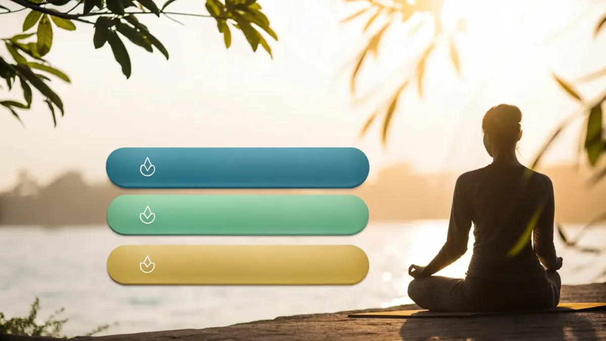
1. Teal blue
Teal and blue-teal shades consistently perform well. They communicate healing, clarity, and renewal without feeling aggressive. Teal reads as calming yet confident, so it works beautifully for wellness brands.
Pair teal with neutrals such as white, cream, navy, charcoal, or softer background tones. Make sure the button has enough contrast to be immediately visible.
2. Fresh green
Green signals growth, transformation, and safety. It aligns strongly with personal development and progress while hinting at abundance in some contexts.
Green pairs well with earth tones, whites, and minimalist layouts. It can be especially effective when your message is about change, forward movement, or transformation. Be sure to choose a vibrant green and stay clear of neon green.
3. Warm gold or soft yellow
A warm gold or muted yellow can feel like a gentle spotlight. It suggests success and motivation without the harshness of a bright yellow. This color works well for spiritual or mindset focused brands where the CTA should feel inviting and slightly luxurious.
Avoid stark yellows. Instead use tones that sit comfortably with purples, navies, whites, blushes, and muted palettes.
Colors to avoid
Red: Pure red is often read as stop, danger, or negative. In wellness contexts it can trigger anxiety or feel too aggressive. Red can work in very specific situations but is usually out of alignment for calm marketing.
Orange: Surprisingly poor performing for wellness. It can read as too fast and pushy, creating a hurried energy that clashes with a nurturing brand.
Neon or overly bright colors: They shout and can feel cheap or frantic. Stay away from neon greens, neon yellows, and similar shades.
Low contrast pastels: These can blend into the background or seem childish. If your button does not stand out visually, it will not convert well.
How to choose the right button color for your brand
Every design decision should match your emotional tone and brand energy. Use these practical steps to pick a color that both looks good and converts.
Start with alignment: Ask what emotion you want the click to create. Calm and trust Lean toward teal. Growth and progress Choose green. Celebration and success Try a warm gold.
Prioritize contrast: Ensure the button stands out from the background. High contrast improves visibility and clickability. Plus Google will limit traffic to any websites that are hard to read.
Avoid overly bright or aggressive hues: If it feels loud, it probably will feel misaligned with wellness messaging.
Test: Small A/B tests can reveal surprising differences. You will not know 100 percent until you try variations on your own pages.
Consider context: One color might work for a pricing page but not for a calming lead magnet. Match color to intent.
Quick checklist before you hit publish
Does the button color contrast clearly with the background?
Does the color reflect the emotional tone you want to communicate?
Is the hue free of neon or harsh brightness?
Have you prioritized readability and perceived value?
Are you prepared to run a simple A B test to validate performance?
Button colors are a small design choice with measurable impact. For coaching and wellness brands lean into teal blue, fresh green, or warm gold. Avoid pure red, orange, neon tones, and low contrast pastels. Test thoughtfully and choose the color that aligns with your message and your audience.
